

Post by RED_NED on Oct 7, 2015 22:46:44 GMT
Hey folks,
Back in the dawn of time I had the idea for the Harkovast game, but the thought of actually being able to create it seemed like a crazy fantasy. Fast forward about 3 years and it's finally going to be printed and be a real thing that people can actually play with their little hands!
When we began playtesting the game, we used crude black and white printouts of the cards, eventually we got more and more creative and the final cards are a lot more sophisticated than the early attempts. Here's some history into the card frames and where we started out compared to where we are now:

These are the earliest playtest images I have, these Repercussions would later become 'Experiences'. This was the very basic version of a card frame so there was no thought to graphic design of the frames, it was just so the information was readable. You can see on the last image that the Abilities of cards (Nobility on this card) were just square boxes.
Ill go through each card type so you can see how they changed:


Scatterpod was the first attempt at a card frame I did for the game. I threw as much graphics on the card as I could, thinking that the more I added the better it would look. It's a mess, but was a case of throwing everything at the card to see what worked. The 'Sword' concept for the stats was one of the first things we came up with and stayed through the whole design.
The Black and White version was a cleaned up version for playtesting. It was a blessing in disguise that the overly complicated frame didn't work for printing out in black and white because it encouraged us to simplify the design.
The third version in the one we got test printed from Gamecrafter.com. We were really surprised at the card quality, and seeing the cards in person gave us a lot of ideas as to what worked and what didn't. Here is where we first added the 'golden ring' in the border to denote starting Champions (inspired by the border of the very first Legend of the 5 Rings ccg). The textured text box and watermark were a hindrance, as were the Magical Element background pictures, and overall we cleaned up the frames for the next version. Here we also changed the card type from 'Personality' to 'Champion' as it sounded more fantasy. We also removed the 'Race' part of the card type as it had no bearing on the game.
The Final version came about when a video game designer friend gave me some pointers and we went full on with simplifying the card frame even further. Playing Hearthstone inspired us to make the numbers bigger and clearer and a contentious point among our game group was switching Elements and Traits to symbols rather than written out words. We made the Ability boxes different shapes to make it easier for colour blind people to tell them apart, but in truth it actually makes the game easier for everyone.


The Regiment card frame evolved pretty much the same as the Champion frame. We tried to visually make the cards look different, while still looking similar (because they are both 'Units'). We settled on a banner style effect under the card title, and in the final card we changed the health orb to a different colour. We also changed the card type to Regiment from it's original name because Champion and Company both start with the same letter.


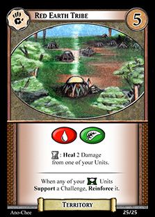
In the very original playtest versions, these were just called Locations, but we changed them to the more fantasy sounding 'Territory' early on. I designed the pictures to have a 'window' feel to them, which stuck through the design, and makes it easy to tell them apart from Units (as well as the fact they dont have stats). We struggled to come up with the 'Exert' symbol for Territories, and finally used a small castle symbol. A late addition was adding magical elements to Territories which was for balance reasons, but also because they dont have Abilities or Health, the cards looked slightly barren and giving them Elements made them visually more exciting.


Events were originally brown, to show they were a neutral card because each player draws from the deck. Apart from looking rather boring, we wanted the front of the card to be the same colour as the back of the card. We originally changed the card colour to red, but after playtesting we found that we confused it with the red Challenge cards, so we opted to have Events be green because that isn't the colour of a Challenge type. Here is where the switch to symbols for Elements really helped, because we could add a whopping big symbol on the top of the card so it was easy to identify. We also changed the card type from 'Challenge Event' to 'Assign Event' because people were confusing the card that said Challenge on it with Challenge cards. Who would have thought?


Challenges were originally going to be bigger square cards, because they get played onto the table and I was imagining them like Smash-Up's Base cards. We playtested them on normal size cards however because it was easier and we realised that Units either supported or Opposed, forming 2 lines. This meant the fact the card was square wouldn't matter at all. Also it would be cumbersome to put with the other decks and more expensive to boot, so we did away with that idea.
For the majority of playing, we had each Challenge write out the rewards you got for winning - Wealth and Power. Due to balance reasons, we made every challenge give you the same rewards for these, and in the final version we decided the remove the reminder from the card (and put it somewhere else). This made the cards a lot cleaner, not being cluttered up with text that you learnt, and ignored, 5 minutes into the game.
Again, the switch to symbols for Traits allowed us to put large symbols on Challenges that cared about them, making it hugely simpler for people to understand what was going on. The final version also has different shaped Ability symbols for each Challenge type.


It's a miracle that Experiences are still in the game. Original designs had players with a separate hand of Experiences that they drew (so players had 2 hands of cards - 3 when they drew challenges!). At one period there were Good Experiences, and Bad Experiences and each Champion could have one of each - meaning that Champions eventually became a pile of cards all attached to each other.
But the people loved them! We finally came to the sane conclusion that we should just have 1 experience per Champion and that it should generally be a positive upgrade. The first draft of this newer streamlined Experience system were still complicated, granting new powers to the Champion that, due to the fact the Experience was tucked underneath them, were always forgotten. We had Experiences give you Health and Weapon/Armour and even give you a minus to your abilities (You were sometimes lucky and got -2 to an Ability you didn't even have).
We finally decided that all Experiences should only give you a bonus to Abilities (not health or anything else) and they all had an effect that only mattered when you gained the experience - a one shot effect. Then they could be tucked under your Champion and the text forgotten about.
We changed the colour of the Experience in the same way as Events, first making the mistake to have it be blue (Which is the colour of Nobility Challenges) and finally decided upon a snazzy purple. Here you can see we also came up with having Sovereigns in game text be replaced with a Sovereign coin symbol, adding to making everything visually easier.


Each player gains the Faction card of their Race when they start the game. It serves as a reminder of who you are playing if all your Units are dead, and has gameplay reminders for newer players.
The original playtest version is simply an info dump on a card, but whowed that there was a lot of information we wanted to give the player. the first attempt at a proper card didn't work. In playtesting we used dice to show our Wealth and Power, but I thought we would be using something else for the final version. The large square card was intended to be used with clip that would slide up and down the card, but the clips destroyed the Faction card pretty quickly.
In the end we decided to just use dice to track Wealth and Power in the final version so we went back to a normal size for the Faction card. (This card is still subject to change as I'm not 100% happy with it).
Okay! So that's a brief history lesson on the card frames and how they look marginally less terrible than the playtest versions we used many moons ago. And if you think these look bad, just look at this monstrosity I briefly considered (for about 0.2 seconds) for Unit cards:

THE HORROR! THE HORROR!
Back in the dawn of time I had the idea for the Harkovast game, but the thought of actually being able to create it seemed like a crazy fantasy. Fast forward about 3 years and it's finally going to be printed and be a real thing that people can actually play with their little hands!
When we began playtesting the game, we used crude black and white printouts of the cards, eventually we got more and more creative and the final cards are a lot more sophisticated than the early attempts. Here's some history into the card frames and where we started out compared to where we are now:
These are the earliest playtest images I have, these Repercussions would later become 'Experiences'. This was the very basic version of a card frame so there was no thought to graphic design of the frames, it was just so the information was readable. You can see on the last image that the Abilities of cards (Nobility on this card) were just square boxes.
Ill go through each card type so you can see how they changed:
Champions
Scatterpod was the first attempt at a card frame I did for the game. I threw as much graphics on the card as I could, thinking that the more I added the better it would look. It's a mess, but was a case of throwing everything at the card to see what worked. The 'Sword' concept for the stats was one of the first things we came up with and stayed through the whole design.
The Black and White version was a cleaned up version for playtesting. It was a blessing in disguise that the overly complicated frame didn't work for printing out in black and white because it encouraged us to simplify the design.
The third version in the one we got test printed from Gamecrafter.com. We were really surprised at the card quality, and seeing the cards in person gave us a lot of ideas as to what worked and what didn't. Here is where we first added the 'golden ring' in the border to denote starting Champions (inspired by the border of the very first Legend of the 5 Rings ccg). The textured text box and watermark were a hindrance, as were the Magical Element background pictures, and overall we cleaned up the frames for the next version. Here we also changed the card type from 'Personality' to 'Champion' as it sounded more fantasy. We also removed the 'Race' part of the card type as it had no bearing on the game.
The Final version came about when a video game designer friend gave me some pointers and we went full on with simplifying the card frame even further. Playing Hearthstone inspired us to make the numbers bigger and clearer and a contentious point among our game group was switching Elements and Traits to symbols rather than written out words. We made the Ability boxes different shapes to make it easier for colour blind people to tell them apart, but in truth it actually makes the game easier for everyone.
Regiments
The Regiment card frame evolved pretty much the same as the Champion frame. We tried to visually make the cards look different, while still looking similar (because they are both 'Units'). We settled on a banner style effect under the card title, and in the final card we changed the health orb to a different colour. We also changed the card type to Regiment from it's original name because Champion and Company both start with the same letter.
Territories
In the very original playtest versions, these were just called Locations, but we changed them to the more fantasy sounding 'Territory' early on. I designed the pictures to have a 'window' feel to them, which stuck through the design, and makes it easy to tell them apart from Units (as well as the fact they dont have stats). We struggled to come up with the 'Exert' symbol for Territories, and finally used a small castle symbol. A late addition was adding magical elements to Territories which was for balance reasons, but also because they dont have Abilities or Health, the cards looked slightly barren and giving them Elements made them visually more exciting.
Events
Events were originally brown, to show they were a neutral card because each player draws from the deck. Apart from looking rather boring, we wanted the front of the card to be the same colour as the back of the card. We originally changed the card colour to red, but after playtesting we found that we confused it with the red Challenge cards, so we opted to have Events be green because that isn't the colour of a Challenge type. Here is where the switch to symbols for Elements really helped, because we could add a whopping big symbol on the top of the card so it was easy to identify. We also changed the card type from 'Challenge Event' to 'Assign Event' because people were confusing the card that said Challenge on it with Challenge cards. Who would have thought?
Challenges
Challenges were originally going to be bigger square cards, because they get played onto the table and I was imagining them like Smash-Up's Base cards. We playtested them on normal size cards however because it was easier and we realised that Units either supported or Opposed, forming 2 lines. This meant the fact the card was square wouldn't matter at all. Also it would be cumbersome to put with the other decks and more expensive to boot, so we did away with that idea.
For the majority of playing, we had each Challenge write out the rewards you got for winning - Wealth and Power. Due to balance reasons, we made every challenge give you the same rewards for these, and in the final version we decided the remove the reminder from the card (and put it somewhere else). This made the cards a lot cleaner, not being cluttered up with text that you learnt, and ignored, 5 minutes into the game.
Again, the switch to symbols for Traits allowed us to put large symbols on Challenges that cared about them, making it hugely simpler for people to understand what was going on. The final version also has different shaped Ability symbols for each Challenge type.
Experiences
It's a miracle that Experiences are still in the game. Original designs had players with a separate hand of Experiences that they drew (so players had 2 hands of cards - 3 when they drew challenges!). At one period there were Good Experiences, and Bad Experiences and each Champion could have one of each - meaning that Champions eventually became a pile of cards all attached to each other.
But the people loved them! We finally came to the sane conclusion that we should just have 1 experience per Champion and that it should generally be a positive upgrade. The first draft of this newer streamlined Experience system were still complicated, granting new powers to the Champion that, due to the fact the Experience was tucked underneath them, were always forgotten. We had Experiences give you Health and Weapon/Armour and even give you a minus to your abilities (You were sometimes lucky and got -2 to an Ability you didn't even have).
We finally decided that all Experiences should only give you a bonus to Abilities (not health or anything else) and they all had an effect that only mattered when you gained the experience - a one shot effect. Then they could be tucked under your Champion and the text forgotten about.
We changed the colour of the Experience in the same way as Events, first making the mistake to have it be blue (Which is the colour of Nobility Challenges) and finally decided upon a snazzy purple. Here you can see we also came up with having Sovereigns in game text be replaced with a Sovereign coin symbol, adding to making everything visually easier.
Faction Card
Each player gains the Faction card of their Race when they start the game. It serves as a reminder of who you are playing if all your Units are dead, and has gameplay reminders for newer players.
The original playtest version is simply an info dump on a card, but whowed that there was a lot of information we wanted to give the player. the first attempt at a proper card didn't work. In playtesting we used dice to show our Wealth and Power, but I thought we would be using something else for the final version. The large square card was intended to be used with clip that would slide up and down the card, but the clips destroyed the Faction card pretty quickly.
In the end we decided to just use dice to track Wealth and Power in the final version so we went back to a normal size for the Faction card. (This card is still subject to change as I'm not 100% happy with it).
Okay! So that's a brief history lesson on the card frames and how they look marginally less terrible than the playtest versions we used many moons ago. And if you think these look bad, just look at this monstrosity I briefly considered (for about 0.2 seconds) for Unit cards:
THE HORROR! THE HORROR!


