|
|
Post by RED_NED on Oct 25, 2015 20:46:42 GMT
In the Rulebook thread, we came to the conclusion that this card is confusing and looked bad: 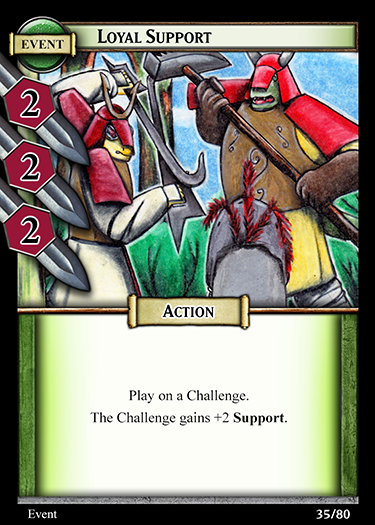 The Ability symbols are unlike anything else in the game which causes people to be confused when they first see it. Other cards that have Ability symbols look like this: 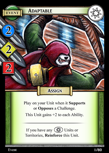 The shape and colour of the symbol is important, as these are what people are associating with each Ability (this is a good thing). So, we need to change the card. The main issue is when the cards are in your hand, they can get mixed up with Assign Events and people end up playing them on their Units by mistake. We need them to look similar enough, but different so you don't do this. Here are the first few ideas we had (We chose to use the same colours and/or shapes of the Ability Symbols): 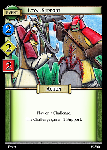  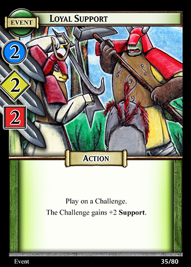    Here's the changes/thoughts in order: 1 - I removed the swords from the Abilities 2 - I made the 'rings' around the Abilities gold 3 - Put a white glow around the Ability Symbols (Hark's favourite) 4 - Same weird hexagon symbol shape, but I made them the correct colour 5 - I removed the swords but added a little border on the side so they weren't just floating in the art 6 - I changed the sword colour. Yeah, not a great idea. I know some of these look bad, I was just brainstorming  These are also really quick mock-ups, so any good ideas will look better when done properly. I'll make the finished version look not terrible (fingers crossed)! |
|
|
|
Post by Harkovast on Oct 26, 2015 0:57:09 GMT
I think some kind of white circle or boarder looks best.
I don't want to use colours as colour blind people might have trouble with that.
|
|
|
|
Post by Canuovea on Oct 26, 2015 2:32:44 GMT
Or an opaque gray, like the reinforcement tokens?
|
|
|
|
Post by RED_NED on Oct 26, 2015 9:03:03 GMT
Here's what a grey version looks like: 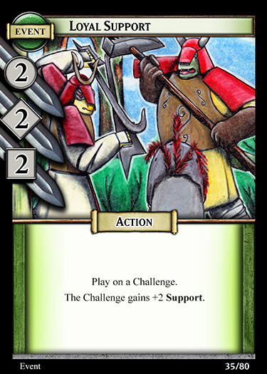 I think having the Challenge colours is important - one issue with the old version is that purple didn't mean anything. I don't think people will get the Reinforce Token colour reference. Saying that though, maybe the shape of the symbols is enough? I think it looks pretty good myself (I wasn't sure it would by the way!). |
|
|
|
Post by Canuovea on Oct 26, 2015 9:14:54 GMT
The one problem I see is that it might be confusing for those who are colourblind. So thinking about it, I'm not sure...
|
|
|
|
Post by RED_NED on Oct 26, 2015 10:03:43 GMT
One thing to remember with colour blindness is that it's mainly seeing a muting of colours so they look similar. It's not a total inability to separate all colours from each other, but using *only* colour to differentiate things (like say, monopoly houses) is harder for people with colour blindness.
What this means is that as long as we have something else (like the abilities being different shapes) that is the main thing we can do. Colour is such a powerful tool to use that we shouldn't disregard it entirely. Having the different ability shapes is enough I feel.
If we made all the symbols green then yes that could be confusing to a colourblind person, but a neutral colour (like white) or a glowing border is enough that someone who is colourblind could easily differentiate them - they don't see in black and white like cats!
All that being said, I don't know anyone who is colourblind and if we can accommodate them 'for free' in terms of design then that's great.
|
|
|
|
Post by Canuovea on Oct 26, 2015 10:05:32 GMT
Yeah, I'm not sure how it works entirely, so it probably should be good. Though in an extreme case it could be that they might think the card is a usual assign event.
|
|
|
|
Post by RED_NED on Oct 26, 2015 11:28:38 GMT
I think that's always going to be a problem with using the swords/ability symbols and/or colours. But change it too much and it just looks odd and confusing. Catch-22 situation at it's finest.
Of course the simplest solution is just to get rid of the ability symbols altogether. That would completely solve the problem of mixing it up in your hand, but would be slightly less obvious on the table.
|
|
|
|
Post by Harkovast on Oct 26, 2015 19:43:28 GMT
I like the one with the edge around it, but do you two prefer the grey colours one?
|
|
|
|
Post by Canuovea on Oct 26, 2015 22:46:20 GMT
Could make it gray and put an edge around it?
|
|
|
|
Post by Harkovast on Oct 26, 2015 23:06:39 GMT
New plan! We are just taking the numbers off those cards and seeing how that works.
The way those particular events work, they probably don't actually need the numbers as they always add the same amount.
|
|
|
|
Post by Canuovea on Oct 26, 2015 23:06:33 GMT
I was thinking about that, yeah.
|
|
|
|
Post by Harkovast on Oct 26, 2015 23:35:27 GMT
Sometimes you have to step back from ideas and see a new way of doing it. You can get a bit close to it where its hard to see your problems.
I tend to find that if a rule has to be worked and over, it might be worth just scrapping and replacing.
Though thats just a rule of thumb, not an absolute!
|
|
|
|
Post by RED_NED on Oct 26, 2015 23:56:09 GMT
We came to the conclusion that the Ability Symbols (which were there as a helpful reminder) were actually being confusing. A case of not being able to see for the wood for the trees.
The Loyal Support cards have changed quite a bit, so it's easy to lose sight of whats best.
Brief history lesson time that no one cares about!
Originally we could had 6 events, 2 for each challenge type. One would give +5 Support and the other +5 Opposition. The idea is these would encourage people to choose different challenges if you had them in your hand.
They worked out being way too conditional, so we instead opted to have 3 that gave +5 Support to a Challenge, and 3 that added +5 Opposition. We later made the rewards you got from challenges for 'Winning by 5' and 'Win Unopposed' which made these cards much more powerful.
A lot later than we should have done, we changed the cards to only add 2 Support/Opposition because merely being able to provide this without committing a Unit is important enough.
All through playtesting we used ability symbols on the cards and it was confusing at first if i recall, but once we explained it then people understood and it became second nature. And now, the poor events are stripped of even this. Gone from a mighty +5 with shiny stat symbols to a measly +2 with no symbols at all.
|
|
|
|
Post by Harkovast on Oct 27, 2015 1:24:23 GMT
I want to write an article about some of the more advanced tactics once the game is released, but I'll say a little here about the use of these cards.
The way the game works is by committing units to support your challenge.
Once a unit has been sent in, they are vulnerable.
They can be damaged by events and attacked by other units.
A card like loyal supports lets you side step your opponent.
It can't be attacked, so you can play it to support your challenge in complete safety.
Your opponent will then have to commit a unit to oppose you (unless he has the equivilant opposition card) and then they are the one committing first, leaving their unit open to attack.
This kind of baiting your opponent or forcing him to commit first is a big part of the deeper tactics and psychology of the game.
|
|


 These are also really quick mock-ups, so any good ideas will look better when done properly. I'll make the finished version look not terrible (fingers crossed)!


